Difference between revisions of "Menu:Button"
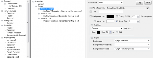
(Created page with "{{ISBoxer 41}} File:ISBoxer 41 - Configuring a Menu Button Set.png as part of a Button Set]] A [[Menu:Butto...") |
|||
| Line 12: | Line 12: | ||
A Menu Button can also be configured to "'''Pull settings from'''" another Button in a Menu or Button Set. Doing so will not only '''copy the appearance and behaviors of the source Button''', but '''also link them together so that any changes to the original will also happen to the copy'''! This makes it easy and convenient to keep one master button for a common task (such as the Key Maps/Menu Hotkeys toggle and Broadcasting Mode toggle) | A Menu Button can also be configured to "'''Pull settings from'''" another Button in a Menu or Button Set. Doing so will not only '''copy the appearance and behaviors of the source Button''', but '''also link them together so that any changes to the original will also happen to the copy'''! This makes it easy and convenient to keep one master button for a common task (such as the Key Maps/Menu Hotkeys toggle and Broadcasting Mode toggle) | ||
| + | |||
| + | == Configuring Menu Buttons == | ||
| + | Menu Buttons can be configured directly as part of a [[Menu:Button Set|Button Set]]. Select a Menu in the top left pane (you may need to create one first) in order to locate Button Sets in the bottom left pane. Once a Button Set is selected in the bottom left pane, the bottom right pane then will show configurable Buttons. To configure appearance, simply select the Button in the list and configure its properties in the new panel to the right. To configure behaviors, right click the Button in the list and choose from the available [[Actions]] (much like configuring a [[Mapped Key]]). | ||
== See Also == | == See Also == | ||
Latest revision as of 13:31, 30 April 2013

A Menu Button is a Button on a Menu (yes, really!) or in a Button Set. Each Button has independently configurable appearance and behavior, although a Template for the Menu provides the base or default appearance.
- A Menu Button's appearance can be made up of
- A background color OR background images (normal state, pressed state, and mouseover state)
- Transparency/Opacity/Alpha (these are different ways of describing how well you see through your button)
- An inside border
- Text
For its behaviors, a Menu Button can hold a list of Actions much like a Step in a Mapped Key, and has an Action Mode setting that can be set to "On Pressed", "On Release" or "Hold"; most typically the desired Action Mode is "Hold". In contrast to a Mapped Key, a Menu Button does not support multiple Steps, reset, or "Do not advance" behaviors; however, it is possible to use a Do Mapped Key Action to perform a Mapped Key configured in that way.
A Menu Button can also be configured to "Pull settings from" another Button in a Menu or Button Set. Doing so will not only copy the appearance and behaviors of the source Button, but also link them together so that any changes to the original will also happen to the copy! This makes it easy and convenient to keep one master button for a common task (such as the Key Maps/Menu Hotkeys toggle and Broadcasting Mode toggle)
Configuring Menu Buttons
Menu Buttons can be configured directly as part of a Button Set. Select a Menu in the top left pane (you may need to create one first) in order to locate Button Sets in the bottom left pane. Once a Button Set is selected in the bottom left pane, the bottom right pane then will show configurable Buttons. To configure appearance, simply select the Button in the list and configure its properties in the new panel to the right. To configure behaviors, right click the Button in the list and choose from the available Actions (much like configuring a Mapped Key).